
Key takeaways
- Strong Shopify landing pages share five structural decisions: focused promise above the fold, social proof early, specific benefits, clear single CTA, friction-removing trust signals.
- The aesthetic varies. The structure doesn’t.
- The single most common failure on Shopify LPs is too many competing CTAs above the fold. Pick one.
- Don’t copy the aesthetic of these brands; copy the decisions.
Ten Shopify landing pages worth taking apart. Each is doing at least one thing measurably well. Treat this as a structural study, not an aesthetic one.
URLs change. Verify each resolves and still matches the teardown before quoting.
Why you can trust us
Four years inside Shopify, hundreds of LP builds across categories. We build Fudge, used by Shopify brands to ship LPs as native theme code in minutes.
1. Single-product launch LP
Brand pattern: consumable DTC launch (oat milk, supplement bottle, fragrance).
What works: the hero is the product, on a clean background, with a single specific headline (“Wake up to softer skin in 14 days”). One CTA. Three benefits below the hero with icons. UGC carousel mid-page. FAQ near the bottom.
Why it works: the visitor knows exactly what they’re being sold within five seconds. No distraction.
Pattern to steal: single product, single promise, single CTA.
2. Bundle / “starter pack” LP
Brand pattern: routine-based brands (skincare, supplements, coffee).
What works: the page sells the bundle, not three individual products. Price comparison ($X individually, $Y together). Photo shows the bundle together. Customer can configure variants.
Pattern to steal: bundles outperform individual SKUs for first-purchase routes. Build the LP around the bundle, not the catalogue.
3. Quiz-entry LP
Brand pattern: Function-of-Beauty-style: the LP exists to start the quiz.
What works: the page does almost nothing except sell the value of the quiz. “Build your personalised X in 60 seconds.” Single CTA: start the quiz.
Pattern to steal: for categories where a quiz outperforms a collection page, build the LP as the quiz-entry, not the catalogue.
4. Comparison LP
Brand pattern: the new entrant comparing itself to a known alternative.
What works: a clear side-by-side (“us vs the legacy option”) highlighting 3-5 honest differences. Reviews from people who switched. Money-back guarantee.
Pattern to steal: for brands fighting an entrenched competitor, the comparison LP often outperforms the generic product LP.
5. Founder-story LP
Brand pattern: founder-led brand with strong founder credibility.
What works: the LP leads with the founder’s photo, a short personal story explaining why the brand exists, then routes to the product with a clear CTA. Press logos near the buy box.
Pattern to steal: when the founder is the brand’s biggest credibility asset, lean into it. Don’t bury the founder in the about page.
6. Press / “as seen in” LP
Brand pattern: brand with legitimate press coverage.
What works: hero with the product, immediately followed by a “as seen in” press strip with real outlets. Then a press quote, then the buy box.
Pattern to steal: if your press coverage is real and recent, surface it early. Buyers shop on credibility cues.
7. Subscription LP
Brand pattern: consumable brand pushing subscribe-and-save.
What works: the LP sells the subscription, not the product. Math at the buy box: “1 box, $40, when you want it” vs “Subscribe, $32/month, free shipping”. Easy pause/cancel language reassures.
Pattern to steal: subscription is the AOV / LTV lever in consumables. The LP should sell the model, not just the product.
8. Sustainability / mission LP
Brand pattern: brand whose differentiator is impact or ethics.
What works: the LP makes the impact concrete (“Every order = 10 plastic bottles removed”). Story page links back. Customer photos showing the brand’s community.
Pattern to steal: for brands where mission is the differentiator, the LP must show specific impact, not generic claims.
9. Limited-edition / drop LP
Brand pattern: streetwear, beauty, art - drop-led brands.
What works: countdown timer (real, not fake), “join the waitlist” CTA before the drop, then live “X of Y remaining” once the drop is live. Email list growth before the drop is part of the design.
Pattern to steal: the drop mechanic compresses purchase intent. If your brand can sustain it, the LP architecture supports it.
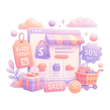
10. Holiday / seasonal LP
Brand pattern: any brand running a Black Friday / Mother’s Day / Christmas campaign.
What works: the seasonal LP doesn’t try to sell every product. One curated edit (“Mother’s Day picks under $50”), one CTA per product, gift-friendly add-ons (gift wrap, gift cards).
Pattern to steal: seasonal LPs that try to be the whole store underperform. Curate aggressively. See Shopify BFCM playbook and Black Friday landing page examples.
The structural patterns that show up in all 10
- One promise above the fold. Specific, benefit-led, scannable in 3 seconds.
- One CTA above the fold. Two competing CTAs cut conversion. Pick one and route everything to it.
- Social proof early. Reviews, UGC, press logos, customer count - somewhere in the top three viewports on mobile.
- Specific benefits, not generic features. “Wake up to softer skin in 14 days” beats “Hydrating formula”.
- Trust signals near the CTA. Returns, payment options, shipping speed, guarantee. Three to five short trust signals.
- Mobile-first. 70-80% of Shopify traffic is mobile. The mobile LP is the LP for most visitors.
For more on what makes LPs convert, see Shopify CRO guide and 12 high-impact CRO tactics. For the architectural question, landing page vs product page.
FAQ
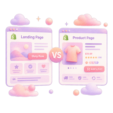
A product page is tied to a single SKU and shows the full catalogue context (variants, related products, cross-sells). A landing page is built for a specific purpose (campaign, ad, launch) with focused content and a single primary CTA. See our landing page vs product page breakdown.
For campaigns above $5-10k monthly spend, usually yes. Below that, the ROI of a custom LP may not clear the build time. Test the impact on a smaller campaign first.
Varies massively by traffic source and product. Warm-email LPs often hit 5-10%. Cold paid-social LPs sit at 0.5-2%. Compare against your own traffic mix, not a generic average.
You need a way to create custom pages, yes. Options: native Shopify pages (limited), a drag-and-drop builder, an AI page builder like Fudge, or a custom theme template built by a developer.
For warm traffic (email, retargeting): shorter, focused on closing. For cold paid traffic: longer, building credibility before the close. There's no universal length - the right length is "as long as needed to close the customer, no longer".