
Key takeaways
- The best Black Friday LPs name the offer specifically, show the products curated, and remove every distraction that isn’t the close.
- The single most common BFCM LP mistake: trying to be the whole store. Curate aggressively - 10-30 SKUs maximum on a single LP.
- Offer clarity > offer size. “40% off everything” outperforms “Up to 70% off select items” because the customer doesn’t have to calculate.
- Urgency cues (real countdown, real stock counts) work. Fake urgency (timer that resets) trains visitors to distrust the site.
This piece looks at structural patterns from Black Friday LPs that worked - and the patterns that didn’t. The aesthetic varies; the decisions don’t.
Why you can trust us
Four years inside Shopify, dozens of BFCM cycles directly supported. We build Fudge, used by stores to ship BFCM LPs in November when the rest of the storefront is frozen.
The patterns that work
1. Single, headline offer above the fold
“40% off everything. November 27-30 only.” That sentence above the fold, in big type, no competing CTAs. The customer should know the offer in two seconds.
The opposite (don’t do this): “Mega Black Friday Sale - Up to 70% off select items - Subscribe for more details - Sign up for early access - Shop now.”
2. Curated product set, not the catalogue
10-30 SKUs maximum on the LP. The ones with the highest expected conversion at the offer price. Not “all products on sale”. A curated edit converts better.
3. Real urgency cues
Real countdown to a real end date. Real “X of Y remaining” on inventory-limited SKUs. Real “Order by Wednesday for delivery before Christmas” shipping cutoff.
The opposite: timers that reset on refresh, fake “low stock” badges that never update.
4. Mobile-first design
70-80% of BFCM traffic is mobile. The mobile LP is the LP. Sticky ATC, single column above the fold, fast LCP. See anatomy of a high-converting Shopify product page for mobile-PDP patterns that apply.
5. Trust signals consolidated
Returns extended for BFCM (“60-day returns through January”), shipping speed clear (“ships in 24 hours”), payment options visible (Apple Pay, Shop Pay, Klarna).
6. Simplified checkout call-to-action
The CTA is “Shop now” or “Get the deal”. Not “Learn more” or “Read more” or “Browse the collection”. One clear action.
7. Social proof tied to the offer
Reviews count + star rating visible. Press strips if you have them. UGC tied to BFCM (“our customers love these picks”).
The patterns that don’t work
1. Fake countdown timers
A timer that says “23:59 left” today, 23:59 left tomorrow, and 23:59 left forever. Customers see through it. Long-term brand cost.
2. Too many competing offers
“30% off everything + free shipping + buy 2 get 1 + free gift over $X”. The customer’s brain gives up. Pick one or two.
3. Generic homepage repurposed as “BFCM LP”
The homepage is for discovery. The BFCM LP is for converting traffic that’s already shown intent. They are different pages. Don’t shortcut by routing BFCM traffic to the homepage.
4. Walls of products with no curation
A 100-SKU grid. Customers don’t browse 100 SKUs on a single page. Curate aggressively.
5. Email capture popup over the offer
If the customer is on your BFCM LP, they’re already deep enough in the funnel that you don’t need their email before showing them the offer. Defer email capture to after the offer is consumed.
6. Slow mobile load
BFCM traffic is huge and impatient. LCP > 3s loses meaningful conversion. Pre-BFCM, Lighthouse-audit your LP. See Shopify page builders speed test.
7. Site-wide “BANNER ANNOUNCEMENT” on every page
A site-wide banner saying “BFCM SALE” on every page, in addition to the LP. Add visual noise without adding conversion. The LP carries the offer; the rest of the site doesn’t need to repeat it.
The structure of a strong BFCM LP
Top to bottom, mobile view:
- Hero - offer headline, real countdown, single CTA
- Trust strip - returns, shipping, payment options (3-5 short items)
- Curated picks - 6-12 SKUs in a clean grid, each with offer price + original price + ATC
- Social proof - review count, star rating, 1-2 customer quotes
- More picks - the next 10-20 SKUs
- FAQ on the offer - 4-6 questions about discount terms, shipping, returns
- Final CTA - “Shop the BFCM sale”
The whole page should be scannable in 60 seconds on mobile.
For wider context see Shopify BFCM playbook, Shopify landing page examples, and 12 high-impact Shopify CRO tactics.
FAQ
Pre-publish with a "coming soon" countdown in early November. Activate the live offer on Black Friday morning. The "coming soon" page captures email signups from early-intent visitors.
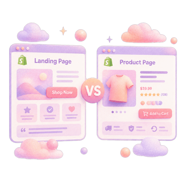
To the LP, for most cold traffic. The LP qualifies the visit and frames the offer specifically. PDPs work for retargeting (warm) traffic that already knows your brand.
3-8% on paid social traffic, 8-15% on email traffic, 15-25% on direct. Highly variable by category and offer strength.
Long enough to close the customer, short enough to scan. For DTC paid traffic, 1-2 mobile viewports of content above the fold + 4-6 below works for most. Add an FAQ block near the bottom.
Not formally. The traffic spike and time pressure make A/B testing hard to read cleanly. Ship the LP you believe in; have a contingency LP ready to swap to if conversion is below target.