
Key takeaways
- High-converting Shopify product pages share a small set of structural decisions, not a particular aesthetic.
- The most important block is the buy box. Everything else exists to get the visitor there with the confidence to add to cart.
- Mobile-first means designing the buy box for mobile first - sticky Add to Cart, condensed trust signals, expandable details.
- Trust signals near the buy box reliably lift cart-to-purchase. Walls of trust badges in the footer don’t.
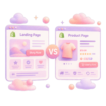
A high-converting Shopify product page isn’t a single style. It’s a stack of decisions about clarity, trust, mobile experience, and removing friction. This piece walks through the anatomy block by block, with the patterns that consistently lift conversion and the ones that consistently don’t.
Why you can trust us
We have spent four years inside the Shopify ecosystem and have rebuilt hundreds of product pages across categories. We also build Fudge, used by hundreds of Shopify stores to ship PDP rebuilds from a prompt as native theme code.
Above the fold
What the customer sees without scrolling. The most important real estate on the store.
Hero image
- A photograph of the product in use, not on a white background, when the category allows
- A single image, not a carousel that auto-rotates and distracts
- Optimised for mobile - the same hero appears prominently on a phone, not cropped awkwardly
- Under 200KB after WebP/AVIF compression
Headline
A specific, benefit-led headline. The product name is implied; the headline does the selling. “Hydrating Night Serum” → “Wake up to softer skin in 14 days, without irritation.”
If the product name itself is the brand promise (cult product, well-known SKU), the headline can lean simpler. For unfamiliar products, the headline does the work.
Price, variant selector, Add to Cart
Visible without scrolling on desktop and mobile. Variant selector pre-selected if there’s a default. ATC button visually dominant; no competing CTAs. Price displayed in the customer’s currency.
Reviews summary
Star rating + review count visible above the fold. Click to open the full reviews block lower on the page. Volume matters more than score - 1,200 reviews at 4.6 beats 12 reviews at 4.9.
Trust block
Three to five condensed trust signals near the buy box: free shipping threshold, returns window, payment options, shipping speed, guarantee. Small, dense, scannable.
Below the fold
What the customer sees once they’ve decided to look further.
Benefits row
Three to four short benefits with icons. “What does this product do for me?” - not “what does this product contain?” Examples: “Vegan formula”, “Cruelty-free”, “Made in California”, “Free shipping over $50.”
Detailed description
A scannable description block. Short paragraphs (1-3 sentences). Subheadings. The same selling points repeated with detail.
Avoid: walls of marketing copy. Walls of spec lists. Both hurt readability.
”How to use” or “What’s included”
For products where usage matters (skincare, supplements, home goods): a short “how to use” block. For products where contents matter (kits, bundles): a “what’s included” block with images.
Reviews block
Full reviews with photos when you have them. Filterable by star rating and content type. Don’t hide bad reviews - filtered transparency builds more trust than hiding them.
For review apps, see best Shopify review apps.
UGC block
If you have user-generated content - Instagram, TikTok, customer photos - a tile or carousel of it. UGC consistently outperforms branded photography for trust.
Cross-sells or “frequently bought together”
One row of cross-sells, no more. Two competing offers hurts more than helps. Best cross-sells are functionally complementary, not just same-category.
FAQ
5-10 product-specific FAQs. Sizing, ingredients, shipping, returns, allergens, compatibility. Schema-marked for rich results.
Returns and shipping policy
A condensed version at the bottom of the PDP. Link to full policy. Don’t make the customer leave the page to read it.
Mobile-specific anatomy
70-80% of Shopify traffic is mobile. The mobile PDP is the PDP for most customers.
Sticky Add to Cart
A fixed bottom bar with the product image thumbnail, name, price, and ATC button. Appears once the customer scrolls past the buy box.
Single-column layout
Mobile is a single column. Don’t try to recreate desktop’s two-column buy box on mobile - it crushes both halves.
Accordion sections for details
Long-form details (description, ingredients, how to use, shipping) collapsed by default in accordions. The customer expands what they care about.
Image gallery as swipeable carousel
Image gallery swipes horizontally with clear indicator dots. First image is the hero; rest are usage shots, detail shots, dimensions, and packaging.
Touch targets
44px minimum, spaced apart. Variant selectors as full-width chips, not tiny dropdown menus.
What kills a PDP’s conversion
Five patterns we see repeatedly on underperforming Shopify product pages.
- Auto-rotating hero carousel. Distracts from the buy box. Use a single image and let the customer browse other shots on demand.
- Generic “Add to Cart” with no price in the sticky bar. The customer has to scroll up to remember the price.
- Trust badges only in the footer. They need to be near the buy box, not at the bottom of the page.
- Walls of marketing copy with no scannable structure. Bullets, subheadings, short paragraphs. Walls of text get skimmed and ignored.
- Modal popups asking for email before the customer has seen the product. Conversion-killer. Defer email capture to after engagement.
For a wider CRO context, see Shopify CRO guide and 12 CRO tactics. For A/B testing PDP variants, see how to A/B test Shopify product pages.
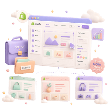
How to build one without rebuilding the theme
Three paths:
- Hire a developer. 20-40 hours of theme work. Best for one-off precision rebuilds.
- Use a drag-and-drop builder. 5-15 hours in the editor. Pays the ongoing app-runtime cost.
- Use an AI agent like Fudge. Describe the PDP rebuild (“hero with usage shot, benefits row, sticky mobile ATC, trust block at buy box, reviews above the fold, FAQ at the bottom”) and ship the change as native theme code. Minutes to first draft.
The right route depends on how often you rebuild PDPs and how much output ownership matters.
FAQ
Clarity at the buy box, mobile speed, trust signals near the ATC, and reviews above the fold. The aesthetic varies; the structural decisions don't.
Single column on mobile (always), two columns on desktop (usually). Don't try to force mobile into a two-column buy box - it crushes both halves.
5-8 covers most cases: hero (in use), lifestyle, detail, dimensions/scale, packaging, optional alternative angles. More than 10 dilutes the highest-value shots.
Summary above the fold (stars + count), full reviews block below the fold. Visible before scrolling builds trust at the moment of consideration; the full block lower satisfies customers who want to read deeper.
Yes, but greyed out with a "notify me when back" CTA. Hiding them creates phantom-product confusion. Greying them captures email demand for future inventory.